Ticino Turismo worked with the Pantone Institute to develop a range of colour schemes that represent the destination's touristic assets.
Ticino Turismo worked with the Pantone Institute to develop a range of colour schemes that match the characteristics of the destination and the main touristic assets. For this campaign, social media images of Ticino were analysed using artificial intelligence to determine which colours are most representative of the region. These colours were named after specific locations in Ticino helping to raise awareness of the destination through creative marketing approaches.
Continue reading...
Get access to 100s of case studies, workshop templates, industry leading events and more.
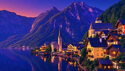
Ticino Turismo worked with the Pantone Institute to develop a range of colour schemes that match the characteristics of the destination and the main touristic assets. Colour is essential for destination marketing to inspire interest in visiting the destination and also help reminisce about memories of previous holidays. For this campaign, social media images of Ticino were analysed using artificial intelligence to determine which colours are most representative of the region.
For summer 2023, the following colours were selected to represent Ticino:
Brissago Blue
Morcote Wisteria Purple
Ritom Lake Emerald
Valle di Muggio Green
Verzasca Turquoise
Other colours have also been created by Pantone that represent the destination, with a range of stories linked to natural and heritage assets:
Gandria Olive Green
Gole della Breggia Rosé Gold
Lugano Sunset Orange
Mogno Marble White
Ticino Camellia Pink
Ticino Chestnut Brown
Valle di Blenio Sunrise Yellow
Having a large range of colours makes it very simple to interchange different elements of the destination within marketing campaigns. Similarly, highlighting specific places within the names of the colours makes it easy to raise awareness about Ticino and the vast diversity of tourism assets in the destination. This helps encourage the equitable distribution of tourists around the destination.
Partnerships
Partnerships can be of strong value to destinations, even with partners from outside the industry. Pantone as a long-established and respected brand name holds a lot of brand equity, which Ticino has been able to leverage for its own destination promotion through licensing the Pantone name and assets. Ticino has successfully utilised Pantone's reputation, whilst creating a distinctive campaign that helps it to stand out in its own right.
Some other successful examples of strong partnerships between destinations and companies include:
VisitDenmark partnered with BoConcept to capitalise on the company's global reach and its representation of Danish identity.
Visit Jersey partnered with Strava for a niche marketing approach to attract aspiring athletes and fitness gurus through the Jersey Runcation Challenge.
Destination Canada partnered with TED to present a new perspective of the destination.
Norse Projects partnered with Adidas to design two models of shoes that reflect the beauty and landscape of the Faroe Islands.
Marketing Opportunities
On Ticino Turismo's website, each Color of Ticino has its own dedicated page sharing relevant information about each of the locations and themes. At the top of the webpage is a short embedded video of approximately 20 seconds in duration, neatly connecting to the rise of short-form video as a key marketing opportunity for destinations. In this video, short clips of the highlighted colour are combined into a collage that vividly represents the key destination attribute, before showcasing the colour name and Ticino Turismo's logo.
After the video is an explanation of what the colour represents and the senses that are evoked by it. This provides further encouragement to imagine being at the destination and elicits interest to book a trip. A large amount of information about the theme and the various activities that can be done in Ticino is provided along with additional video content. Ticino Turismo has also developed a Spotify playlist for each of the Colors of Ticino to set the vibes and expectations for experiencing the different elements of the destination.
The website even directs visitors to special offers, namely a 20% discount on the nightly rate at specific hotels and on public transport. This helps to drive conversion from an interest in visiting into actual bookings and is especially attractive to cost-conscious travellers who are looking for bargains during the global cost of living crisis. Additionally, it also helps to build a rapport with potential visitors who value the transparency of Ticino to direct visitors towards identifying the best value for money when purchasing a holiday.
Through this campaign, Ticino Turismo helps to get people in the mood for travel by stimulating various senses, including visual aesthetics and sounds. This helps people to get a much more detailed picture of the character of the destination and acts as an effective way to implement a try-before-you-buy approach to help visitors, showing that VR is not the only tool DMOs can use to reassure potential visitors about their destination's offering.
Gamification
As part of the campaign, Ticino Turismo launched a memory game where visitors on their website match the Colors of Ticino to pictures of the destination to enter a competition for the chance to win hotel stays or visitor attractions in the region. The game is extremely simple and easy to understand, making it easily accessible for a range of different nationalities. Following the successful completion of the game, competitors complete a Jotform to enter their personal details, travel expectations and select the colour that best represents their personality. This also serves the purpose of obtaining additional subscribers for newsletters and boosting the reach of this marketing tool into the future to encourage repeat visitation and help to push prospective visitors through the conversion channel.
Key Takeaways
Artificial Intelligence can analyse photos to identify key features of a destination, which can then be creatively incorporated into strengthening marketing activities.
DMOs and the wider tourism sector can establish partnerships with non-tourism organisations to capitalise on their brand equity and augment destination marketing activities
Marketing should evoke multiple senses and incorporate a range of elements to fully maximise the potential of a campaign.
Highlighting special offers on destination websites and being transparent builds rapport with customers, making them more responsive to your message.
Gamification helps to build interactivity and the ability to increase future marketing reach through collecting emails and data that can be used for better targeting in future email marketing campaigns.
Published on:
June 2023
About the contributor
SUSTAINABILITY LEADERSHIP PROGRAMME
Become a certified Sustainability Advocate
Created for destinations around the world, this programme will provide the insight to help you become a sustainability leader within your organisation.
Designed to teach you how to master must-have tools and acquire essential skills to succeed in managing your destination or organisation, be ready to challenge all of your assumptions.
Designed to teach you how to master must-have tools and acquire essential skills to succeed in managing your destination or organisation, be ready to challenge all of your assumptions.
%20(1).webp)